I'm always excited to take on new projects and collaborate with innovative minds.

Phone

+1 234 567 890

Email

contact@botble.com

Website

https://botble.com

Address

123 Main Street, New York, NY 10001

Social

Project

Branding for Bright Digitally

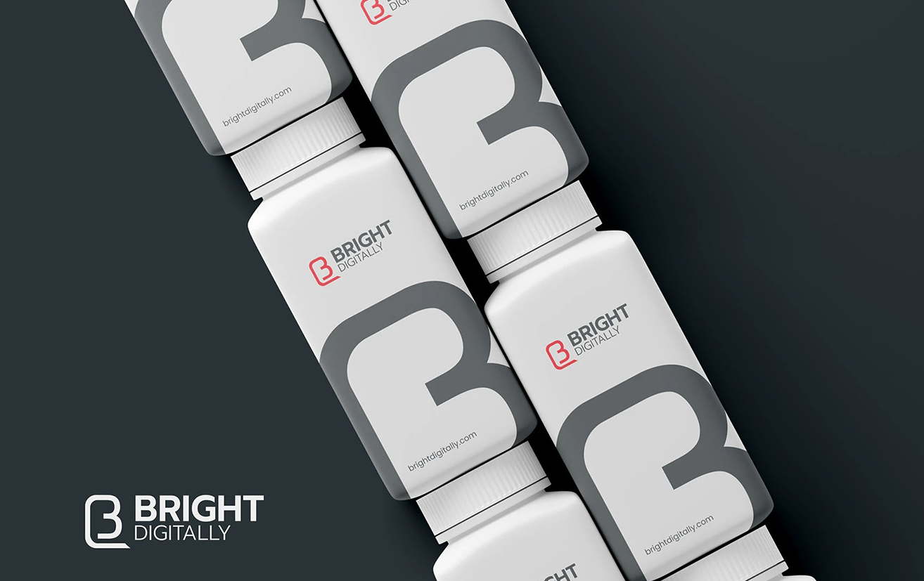
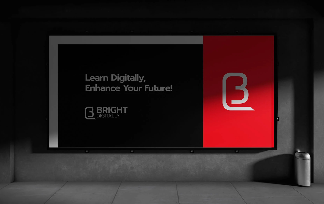
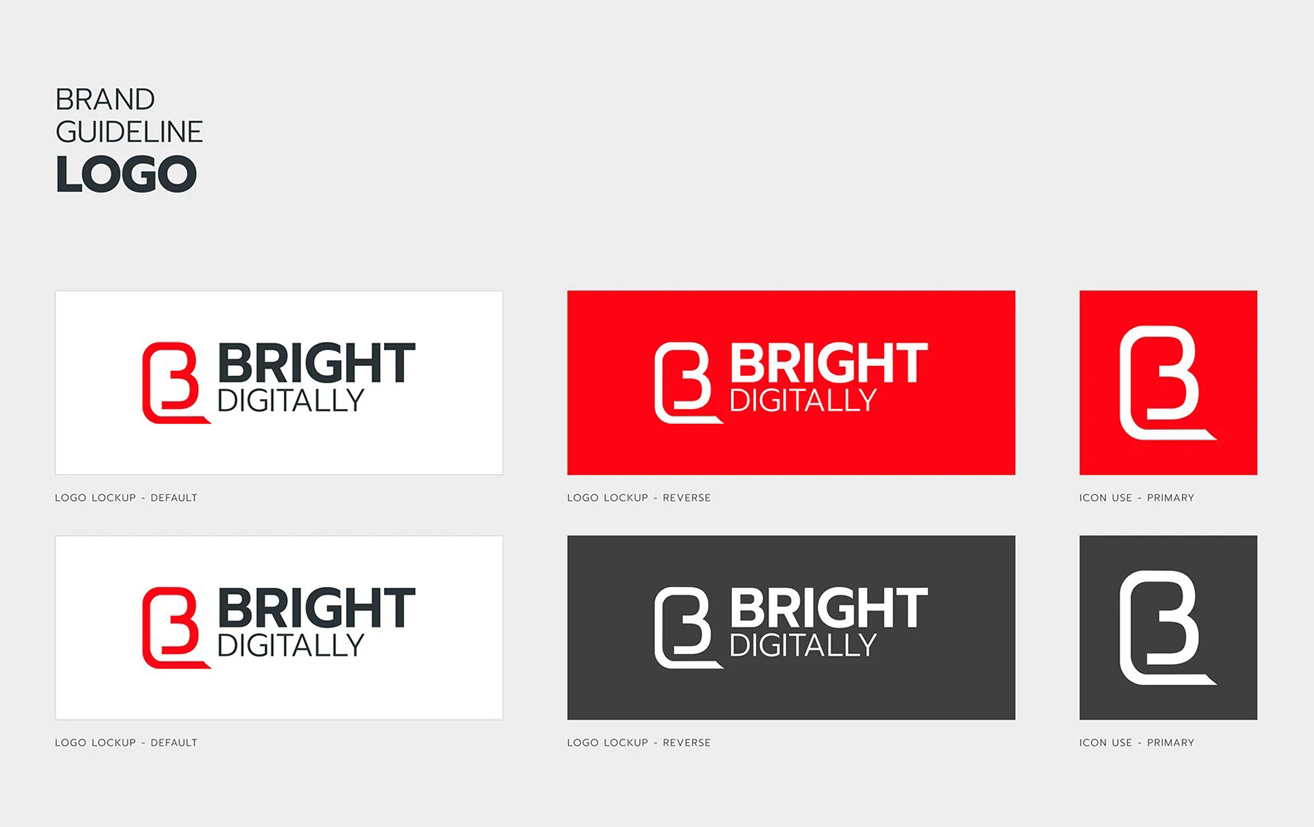
The Bright Digitally logo features a modern, bold design that combines a sleek red “B” icon with strong, clean typography. Representing innovation and digital communication, the logo uses a minimalist color palette of red, black, and white to convey clarity, professionalism, and a forward-thinking brand identity.

Client

Bright Digitally Limited

Start Date

Feb 04, 2025
Branding for Bright Digitally

Brand Name: BRIGHT DIGITALLY
This name represents a forward-thinking, modern digital brand.

Logo Composition:

  • Primary Logo Lockup:

    • Icon: A stylized “B” in red with a rounded, modern design. The bottom of the B has a speech-bubble-like tail, suggesting communication or digital interaction.
    • Text:
      • BRIGHT: Bold, uppercase, black font. Modern sans-serif typeface for clarity and impact.
      • DIGITALLY: Smaller, uppercase, black font. Thin sans-serif typeface to contrast and complement “BRIGHT.”
  • Hierarchy:

    • Icon on top
    • “BRIGHT” (dominant)
    • “DIGITALLY” (supporting tagline)Typography
  • Primary Font: Bold, geometric sans-serif (similar to Montserrat or Gotham Bold)
  • Secondary Font: Light or regular sans-serif (similar to Open Sans or Roboto Light)
  • Case: All uppercase for a clean, professional aesthetic

Logo Usage:

  • Minimum Size: Ensure the icon and text are always legible.
  • Clear Space: Maintain a clear space around the logo equal to the height of the “B” icon to prevent visual clutter.
  • Backgrounds:
    • Preferred: White or very light backgrounds
    • Dark backgrounds: Use a white or light variant of the logo (if created)
    • bright-digitally-3
      bright-digitally-2
      bright-digitally-1
       
Share

Leave a comment

Your email address will not be published. Required fields are marked *